GSSoC: Second Month Summary
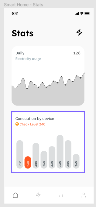
This month comprised of the development of the Stats Screen, which would show the user, the statistics of the electricity usage by appliances, daily, weekly or monthly. The design can be viewed below.
Implementation⌗
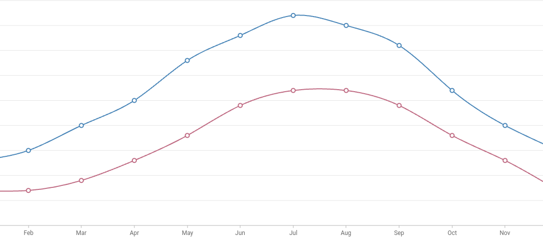
The implementation of the design was achieved with the help of a flutter package syncfusion_flutter_charts which is a data visualisation library that plots the graph based on the provided data. Moreover, it also allows flexibility with the chart selection, be it, cartesian, line, bar, spline, etc.
However, in this case, I chose the Spline Chart for their ease of data representation. Below is visual representation of a sample data using spline curve.
Winding Up⌗
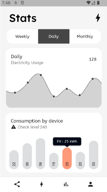
Following is a snippet of the final implementation of the design as viewed from the android emulator.
And, that will be all for this post. If you found the work interesting and wish to take a glance at the source code, hop over to Source Code.